Alert
final class Phui\Components\Alert
An icon and a message, both in the colour of the alert's severity. Fills the width available to it. Takes no focus and emits nothing.
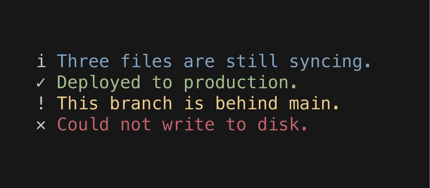
php
use Phui\Components\Alert;

Alert::mount()->props(
    type: Alert::ERROR,
    message: 'Could not write to disk.',
);
Props
| Prop | Type | Default | Description |
|---|---|---|---|
type | string | Alert::INFO | Which severity to render. |
message | string|StyledString | '' | The text beside the icon. |
infoChar | string | 'i' | Icon for Alert::INFO. |
successChar | string | '✓' | Icon for Alert::SUCCESS. |
warningChar | string | '!' | Icon for Alert::WARNING. |
errorChar | string | '✕' | Icon for Alert::ERROR. |
Constants
| Constant | Value |
|---|---|
Alert::INFO | 'info' |
Alert::SUCCESS | 'success' |
Alert::WARNING | 'warning' |
Alert::ERROR | 'error' |
An unrecognised type falls back to the info icon and colour.
Colours
Phui\Components\Colours\AlertColours
| Colour | Palette default | Used for |
|---|---|---|
info | info | Icon and message when type is info. |
success | success | Icon and message when type is success. |
warning | warning | Icon and message when type is warning. |
error | danger | Icon and message when type is error. |