Checkbox
final class Phui\Components\Checkbox
A bracketed marker followed by a label, bound to a boolean. Takes focus.
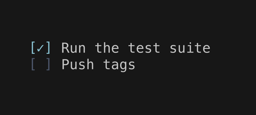
php
use Phui\Components\Checkbox;
use Phui\Events\EmitEvent;

Checkbox::mount()
    ->props(label: 'Ready to ship', checked: $this->ready)
    ->on('change', fn (EmitEvent $e) => $this->ready = $e->data);
Props
| Prop | Type | Default | Description |
|---|---|---|---|
label | string|StyledString | '' | The text after the box. |
checkedChar | string | '✓' | The marker shown when checked. |
uncheckedChar | string | ' ' | The marker shown when unchecked. |
Models
The component holds this and emits on every change. Pass it as a prop to take ownership, and handle its emit — see binding a value both ways.
| Model | Type | Default | Emits |
|---|---|---|---|
checked | bool | false | change |
Emits
| Event | Payload | Emitted when |
|---|---|---|
change | bool | The box is toggled. |
Input
| Input | Action |
|---|---|
| Enter Space | Toggle |
| Left click | Toggle |
Colours
Phui\Components\Colours\CheckboxColours
| Colour | Palette default | Used for |
|---|---|---|
bracket | muted | The [ and ] at rest. |
bracketFocused | accent | The [ and ] while focused. |
marker | muted | The marker while unchecked. |
markerChecked | accent | The marker while checked. |