Slider
final class Phui\Components\Slider
A track filled up to value, growing to the width available to it. Steps are clamped to min and max, so the value never leaves the range. Takes focus.
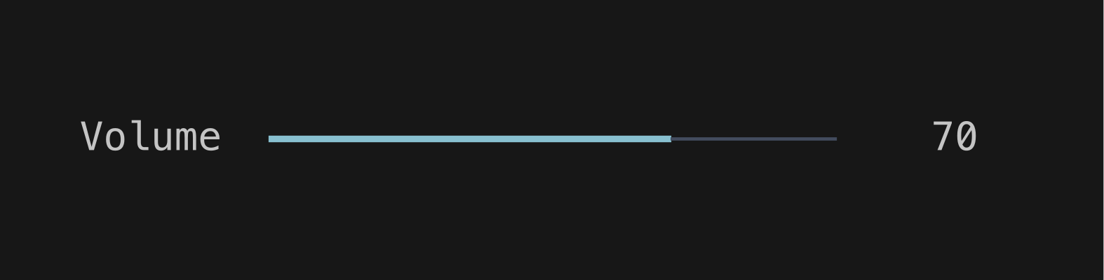
php
use Phui\Components\Slider;
use Phui\Events\EmitEvent;

Slider::mount()
    ->props(min: 0, max: 100, step: 5, value: $this->volume)
    ->on('change', fn (EmitEvent $e) => $this->volume = $e->data);
Props
| Prop | Type | Default | Description |
|---|---|---|---|
min | int | 0 | Lowest value the track represents. |
max | int | 10 | Highest value the track represents. |
step | int | 1 | How far one keypress or scroll notch moves the value. |
fillChar | string | '━' | Repeated up to the thumb. |
emptyChar | string | '─' | Repeated after the thumb. |
leftBracketChar | string | '' | Drawn before the track. Omitted while empty. |
rightBracketChar | string | '' | Drawn after the track. Omitted while empty. |
Models
The component holds this and emits on every change. Pass it as a prop to take ownership, and handle its emit — see binding a value both ways.
| Model | Type | Default | Emits |
|---|---|---|---|
value | int | 0 | change |
Emits
| Event | Payload | Emitted when |
|---|---|---|
change | int | The value moves. |
Input
| Input | Action |
|---|---|
| ← ↓ h j | Decrease by step |
| → ↑ l k | Increase by step |
| Scroll wheel | Increase scrolling up, decrease scrolling down |
Colours
Phui\Components\Colours\SliderColours
| Colour | Palette default | Used for |
|---|---|---|
fill | muted | The filled part of the track at rest. |
fillFocused | accent | The filled part, and the brackets, while focused. |
empty | surface | The remainder of the track. |