ItemList
final class Phui\Components\ItemList
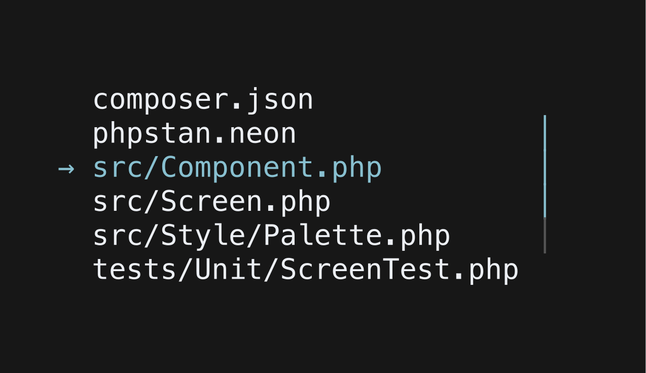
A virtualised list of lines with one of them selected. Only the rows in view are built, so the list stays cheap however many items it holds, and the selection is kept scrolled into view. Takes focus.
php
use Phui\Components\ItemList;
use Phui\Events\EmitEvent;

ItemList::mount()
    ->props(items: $this->files, selected: $this->cursor, maxHeight: 12)
    ->on('change', fn (EmitEvent $e) => $this->cursor = $e->data);
Props
| Prop | Type | Default | Description |
|---|---|---|---|
items | array<int, string|StyledString> | [] | The lines to render. |
maxHeight | int | 10 | Rows visible before the list scrolls. |
selectedChar | string | '→' | Marker beside the selected row. |
unselectedChar | string | ' ' | Marker beside every other row. |
Models
The component holds this and emits on every change. Pass it as a prop to take ownership, and handle its emit — see binding a value both ways.
| Model | Type | Default | Emits |
|---|---|---|---|
selected | int | 0 | change |
Emits
| Event | Payload | Emitted when |
|---|---|---|
change | int | The selected index moves. |
Input
| Input | Action |
|---|---|
| ↑ k | Previous item |
| ↓ j | Next item |
| Left click | Select the clicked row |
Movement stops at the first and last item rather than wrapping, and the selected row only takes its highlight colour while the list holds focus.
Colours
Phui\Components\Colours\ItemListColours
| Colour | Palette default | Used for |
|---|---|---|
item | text | Unselected rows, and the selected row while unfocused. |
itemSelected | accent | The selected row while focused. |
marker | muted | The marker beside unselected rows. |
markerSelected | accent | The marker beside the selected row. |
scrollThumb | accent | The scrollbar thumb. |