Tabs
final class Phui\Components\Tabs
A row of labels with the current one highlighted. Unlike the other selectable built-ins, selected is a plain prop rather than a model: Tabs has no keys of its own, so the parent moves the tab in response to change and to whatever bindings it declares itself. Takes no focus; it responds to clicks only.
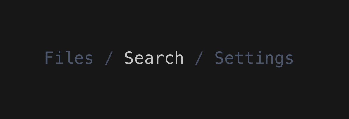
php
use Phui\Components\Tabs;
use Phui\Events\EmitEvent;

Tabs::mount()
    ->props(tabs: ['Files', 'Search', 'Settings'], selected: $this->tab)
    ->on('change', fn (EmitEvent $e) => $this->tab = $e->data);
Props
| Prop | Type | Default | Description |
|---|---|---|---|
tabs | string[] | [] | The tab labels. |
selected | int | 0 | Index of the current tab. |
separator | string | '/' | Drawn between tabs. |
Emits
| Event | Payload | Emitted when |
|---|---|---|
change | int | A tab is left-clicked. |
Colours
Phui\Components\Colours\TabsColours
| Colour | Palette default | Used for |
|---|---|---|
tab | muted | Tabs other than the current one. |
tabSelected | accent | The current tab, which is also bold. |
separator | surface | The separators between tabs. |