Button
final class Phui\Components\Button
A label inside a rounded border. Takes focus and emits press when activated; while disabled it drops out of focus traversal and ignores both key and mouse presses.
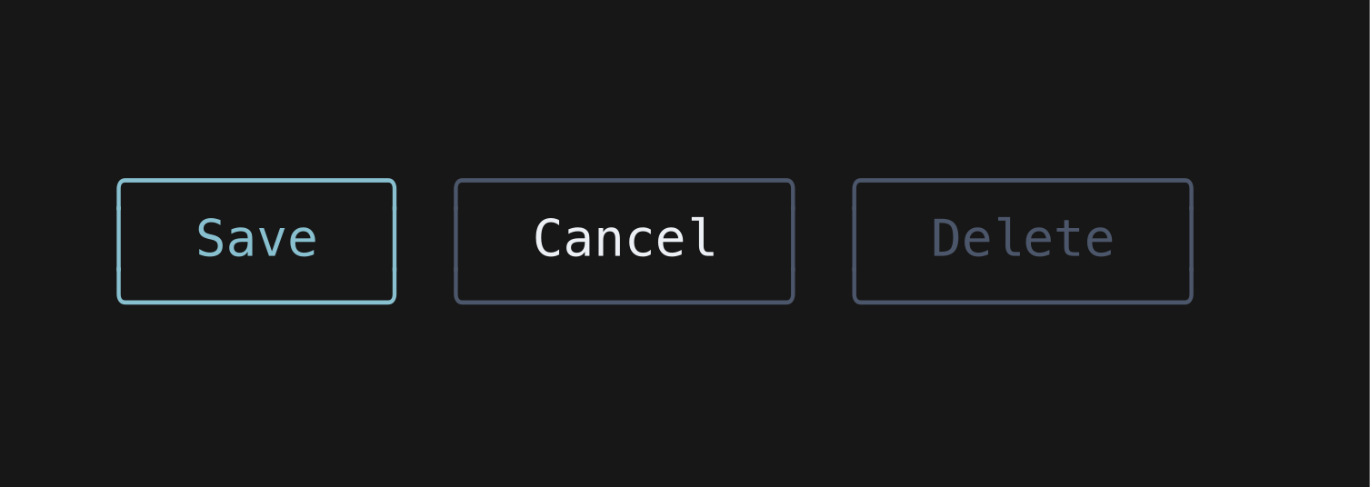
php
use Phui\Components\Button;

Button::mount()
    ->props(label: 'Save', disabled: $this->saving)
    ->on('press', fn () => $this->save());
Props
| Prop | Type | Default | Description |
|---|---|---|---|
label | string|StyledString | 'Submit' | The text inside the border. |
disabled | bool | false | Greys the button out and stops it emitting. |
borderChars | ?BorderCharSet | null | The border to draw. Defaults to BorderCharSet::rounded(). |
Emits
| Event | Payload | Emitted when |
|---|---|---|
press | null | The button is activated and is not disabled. |
Input
| Input | Action |
|---|---|
| Enter Space | Press |
| Left click | Press |
Colours
Phui\Components\Colours\ButtonColours
| Colour | Palette default | Used for |
|---|---|---|
text | text | The label at rest. |
textFocused | accent | The label while focused. |
textDisabled | muted | The label while disabled. |
border | muted | The border at rest. |
borderFocused | accent | The border while focused. |
borderDisabled | muted | The border while disabled. |