ProgressBar
final class Phui\Components\ProgressBar
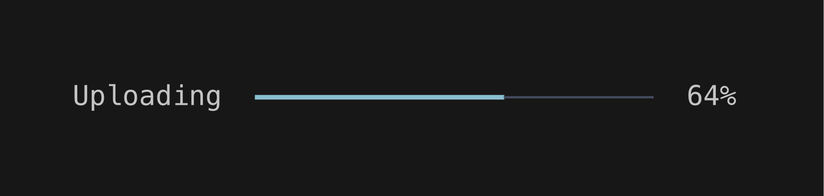
A bar filled to current / max, growing to the width available to it, with an optional percentage on the right. The fraction is clamped to 0–1, and a max of zero or less reads as 0%. Takes no focus and emits nothing.
php
use Phui\Components\ProgressBar;

ProgressBar::mount()->props(current: $this->done, max: $this->total);
Props
| Prop | Type | Default | Description |
|---|---|---|---|
current | int | 0 | How much of max is complete. |
max | int | 100 | The value that counts as full. |
showPercent | bool | true | Whether to render the percentage after the bar. |
prefix | string | '' | Text before the bar. |
postfix | string | '%' | Suffix on the percentage. |
filledChar | string | '━' | Repeated across the filled part. |
emptyChar | string | '─' | Repeated across the remainder. |
Colours
Phui\Components\Colours\ProgressBarColours
| Colour | Palette default | Used for |
|---|---|---|
fill | accent | The filled part of the bar. |
empty | surface | The remainder of the bar. |