MultiSelect
final class Phui\Components\MultiSelect
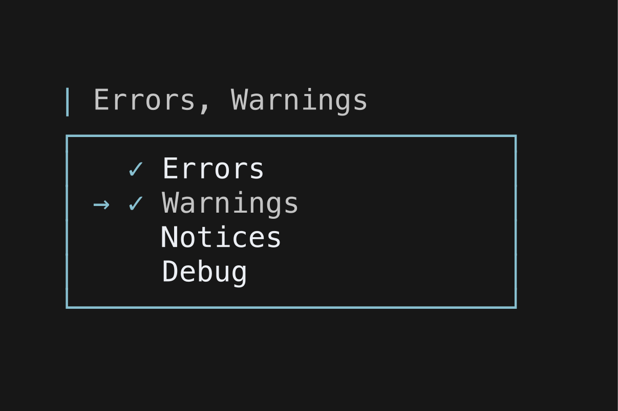
A trigger showing the chosen labels, which opens a floating list where several options can be ticked. The trigger takes focus; opening it raises a modal layer anchored beneath, which holds focus while open and hands it back on close.
selected holds indices into options, kept sorted and free of duplicates.
php
use Phui\Components\MultiSelect;
use Phui\Events\EmitEvent;

MultiSelect::mount()
    ->props(
        options: ['Errors', 'Warnings', 'Notices'],
        selected: $this->levels,
        placeholder: 'All levels',
    )
    ->on('change', fn (EmitEvent $e) => $this->levels = $e->data);
Props
| Prop | Type | Default | Description |
|---|---|---|---|
options | string[] | [] | The options to list. |
placeholder | string | 'Select…' | Shown on the trigger while nothing is selected. |
maxHeight | int | 10 | Options visible before the list scrolls. |
accent | string | '|' | The marker at the head of the trigger. |
selectedChar | string | '✓' | Marker beside a ticked option. |
unselectedChar | string | ' ' | Marker beside an unticked option. |
hoveredChar | string | '→' | Marker beside the option under the cursor. |
unhoveredChar | string | ' ' | Marker beside every other option. |
Models
The component holds this and emits on every change. Pass it as a prop to take ownership, and handle its emit — see binding a value both ways.
| Model | Type | Default | Emits |
|---|---|---|---|
selected | int[] | [] | change |
Emits
| Event | Payload | Emitted when |
|---|---|---|
change | int[] | An option is ticked or unticked. |
Input
| Input | Action |
|---|---|
| Enter | Open the list |
| Left click | Open the list |
While the list is open:
| Input | Action |
|---|---|
| ↑ k | Previous option |
| ↓ j | Next option |
| Space | Toggle option |
| Enter | Tick the option under the cursor, then close the list |
| Esc | Close the list, leaving the selection as it is |
| Left click | Toggle the clicked option |
Colours
Phui\Components\Colours\MultiSelectColours
| Colour | Palette default | Used for |
|---|---|---|
value | text | The trigger label at rest. |
valueFocused | accent | The trigger label while focused. |
marker | muted | The trigger accent with nothing selected, and unticked option markers. |
markerActive | accent | The trigger accent with a selection, ticked option markers, and the list border. |
option | text | Options in the list. |
optionCursor | accent | The option under the cursor. |