ItemTable
final class Phui\Components\ItemTable
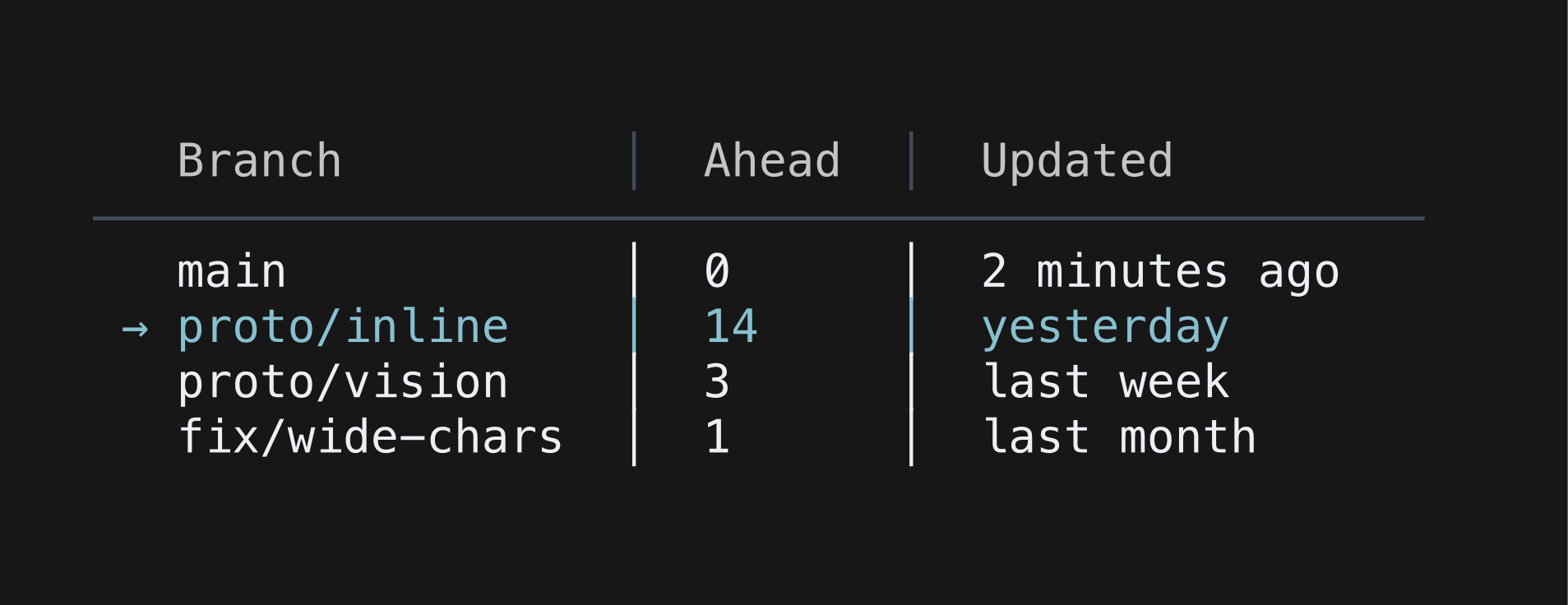
A virtualised table with a header row and one selected row. Columns are sized from their widest header or cell, capped at maxRowWidth, and cells too wide for their column are truncated with an ellipsis. The number of columns comes from headers — extra cells in a row are ignored, missing ones render blank. Takes focus.
php
use Phui\Components\ItemTable;
use Phui\Events\EmitEvent;

ItemTable::mount()
    ->props(
        headers: ['Name', 'Size', 'Modified'],
        rows: $this->files,
        selected: $this->cursor,
    )
    ->on('change', fn (EmitEvent $e) => $this->cursor = $e->data)
    ->on('activate', fn (EmitEvent $e) => $this->open($e->data));
Props
| Prop | Type | Default | Description |
|---|---|---|---|
headers | array<int, scalar> | [] | The header cells, which also fix the column count. Compared deeply. |
rows | array<int, array<array-key, scalar>> | [] | The body rows. Compared deeply. |
maxRows | int | 50 | Rows visible before the table scrolls. |
maxRowWidth | int | 50 | Widest a single column may grow. |
separator | string | '│' | Drawn between columns. |
selectedChar | string | '→' | Marker beside the selected row. |
unselectedChar | string | ' ' | Marker beside every other row. |
Models
The component holds this and emits on every change. Pass it as a prop to take ownership, and handle its emit — see binding a value both ways.
| Model | Type | Default | Emits |
|---|---|---|---|
selected | int | 0 | change |
Emits
| Event | Payload | Emitted when |
|---|---|---|
change | int | The selected row moves. |
activate | int | The selected row is activated. |
Input
| Input | Action |
|---|---|
| ↑ k | Previous row |
| ↓ j | Next row |
| Enter Space | Activate row |
| Left click | Select the clicked row |
Colours
Phui\Components\Colours\ItemTableColours
| Colour | Palette default | Used for |
|---|---|---|
header | text | The header row at rest. |
headerFocused | accent | The header row while focused. |
row | text | Unselected rows, and the selected row while unfocused. |
rowSelected | accent | The selected row while focused. |
marker | muted | The marker beside unselected rows. |
markerSelected | accent | The marker beside the selected row. |
separator | surface | The column separators and the rule under the header. |
scrollThumb | accent | The scrollbar thumb. |